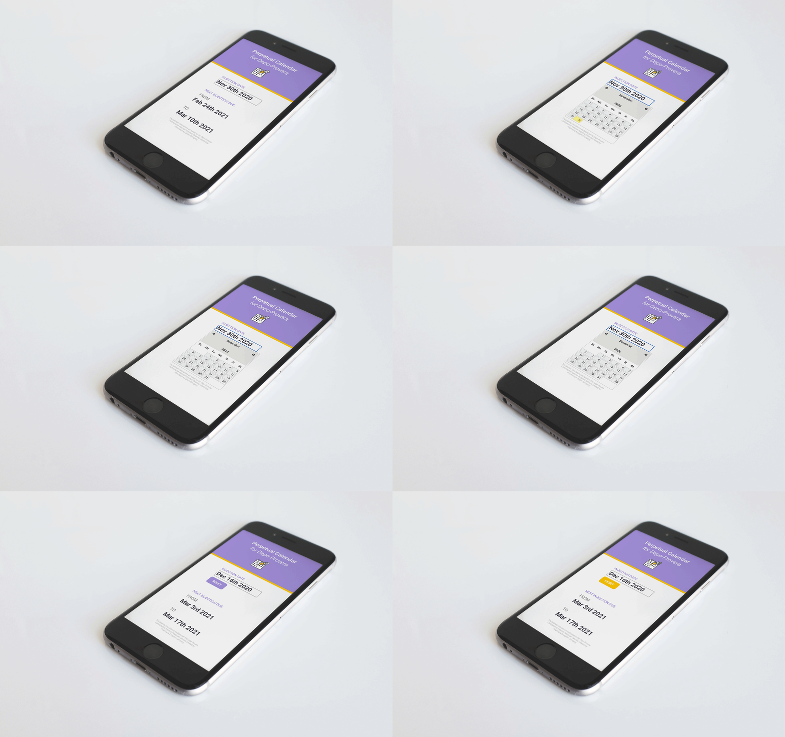
EMDixon-Roche Designs
A web-app and chrome-extension where nurses can copy and paste the patient follow-up date range directly into patients’ electronic health records.
End-to-end UX/UI Design, Product Design, Front and Backend Web Development..
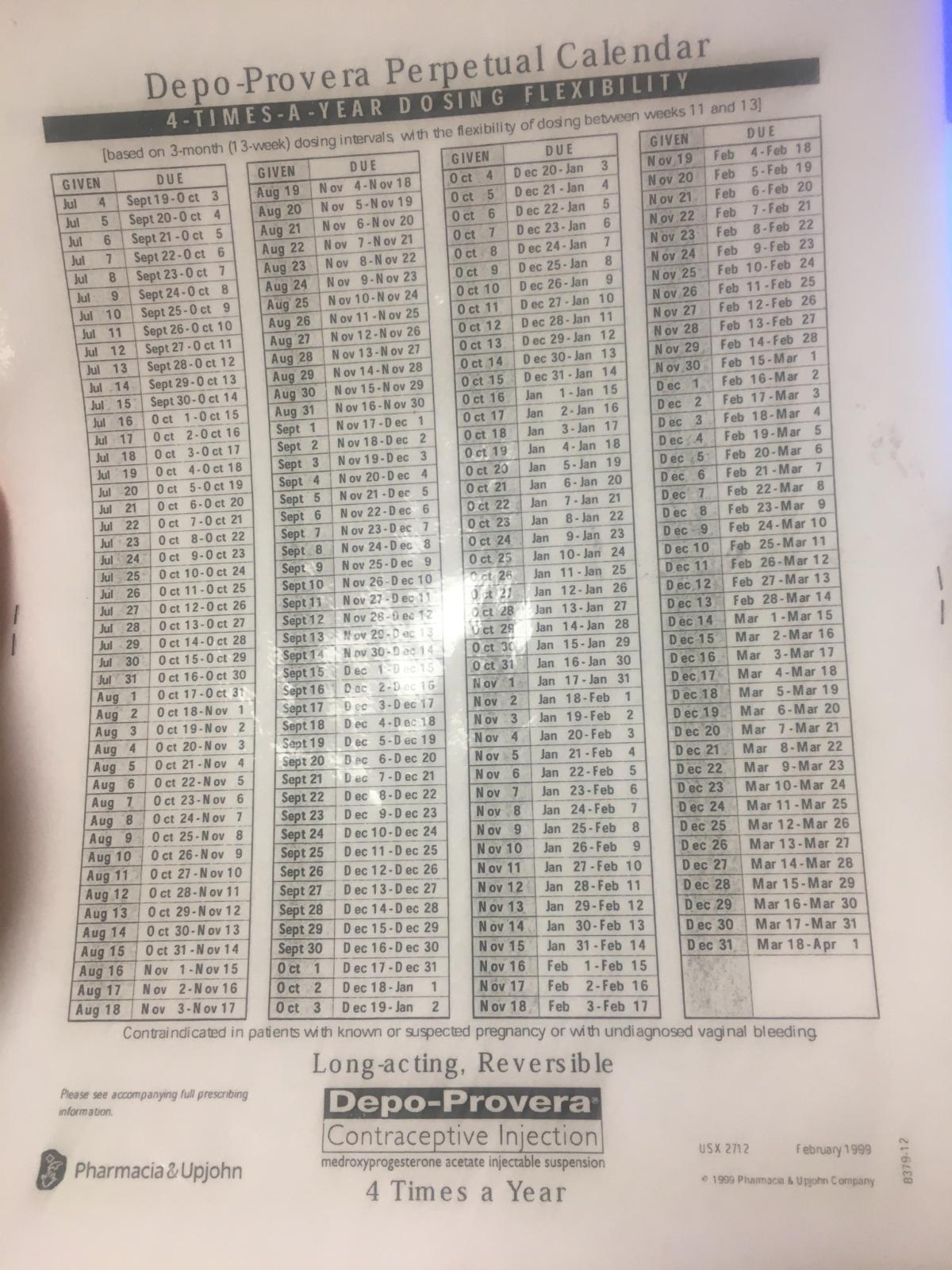
After hearing a nurse complain about a repetitive and time-consuming process, I interviewed other nurses about the same pain points. They said they hated having to look up the date range for patient follow-up injections of Depo-Provera using a printed or digital PDF from 1999. This PDF was sometimes laminated, sometimes not, and sometimes had to be looked up on the computer.
Shared laminated calendar printout
Nurses had numerous patients throughout the day, and they said it was annoying to be always looking for the PDF or online. Each time they looked up dates throughout the day, the process felt frustrating and inefficient. They could not believe an app or website did not already exist to solve this, and the app that did exist did not satisfy their needs.
I saw the potential to create a product with an immediate value proposition for an existing client base–a web-based calculator to replace the PDF.
I discovered two competing products:
The perpetual calendar PDF created by Pharmacia & Upjohn Company is a two-sided printout of a table with a line for each date of the year with the corresponding date range. It is the most widespread method currently used by nurses.
Pros
Cons
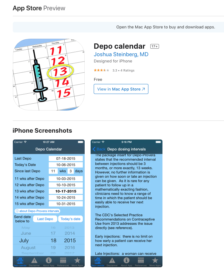
The “Depo calendar” app had a 3.3 out of 4-star rating over five years.
The user input the injection date and received the corresponding date for their follow-up appointment.
"Depo calendar" in Apple Store
Pros
Cons
None of the nurses I spoke with had tried the Depo calendar app.
Analysis of the feedback from local nurses showed a universal consensus. They needed a simple calculator where they entered the injection date and received the date range in a particular format they could copy and paste into their patients' forms.
The end users’ goals were to:
Although the nurses liked the idea of an app-based solution, they really needed a way to access the calculator while they were on their computer.
By researching how nurses were looking up and saving the date range, a couple of solutions immediately became apparent.
Ideation led me to conclude that two solutions would best solve their problem:
The Chrome extension idea came from what browsers the nurses and their peers used. Although everyone I spoke to used Google Chrome, it was unreasonable to extrapolate this to the entire user population. Hence, the need for an additional cross-platform web app.
As a healthcare product, I also had to ascertain whether there would be any potential HIPPA issues. Since no patient data was stored or entered, only generic dates, I concluded that the calculator didn’t have any HIPPA hurdles.
Four main areas of improvement would boost the product’s chance of gaining widespread adoption:
A mobile-optimized web app and Chrome extension where nurses could copy and paste follow-up date ranges directly into patients’ electronic health records using their computer browser.
Leveraging my scientific illustration experience with The Smithsonian Institute (example illustrations), I first created the logo to inform the rest of the brand. The two main words associated with the calculator are "injection" and "date." Lucky for me, these are two visual elements: a hypodermic needle and a calendar.
My two competitors did not have clear branding. It was a clear opportunity for my product to stand out. By branding my product and therefore giving it an identity, it would have cross-platform recognition.
I created the logo first, informing the rest of the design brand. The two main words associated with the calculator are "injection" and "date." Luckily for me, these are two visual elements: a hypodermic needle and a calendar.
The main design requirement was "simple," but I felt a close second was "approachable." I made sure the needle looked as friendly as possible and used a calendar representation. During the design iteration, I saw a neat opportunity for the injection drop to represent the day of the injection.
Logo design iterations
A nurse volunteered a mockup of their product design vision.
Using the mockup as a jumping-off point, I distilled out the design essentials.
Everything needed to be immediately viewable and accessible on one screen with the least amount of information and words possible while still achieving the user end-goals.
To achieve the user goal of getting a date range, the on-screen information needed to have:
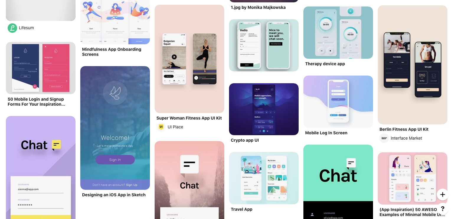
The UI needed to be simple. I created a mood board based on simple user interfaces and calm colors.
Moodboard created in Pinterest
Starting with a mobile-first design in grayscale, I then added the chosen color scheme, extrapolating to desktop design.
UI design iterations
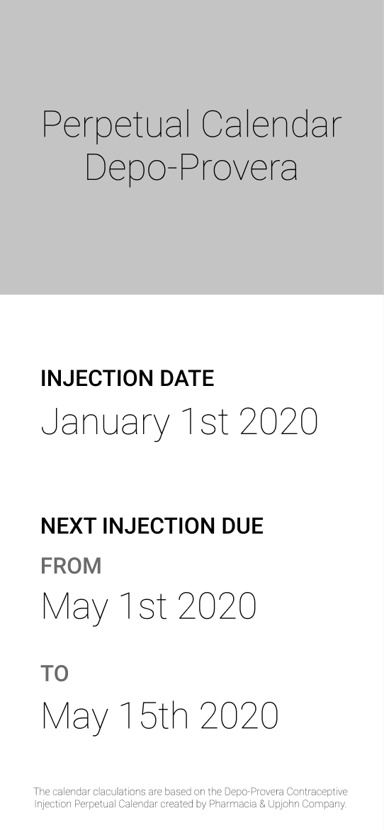
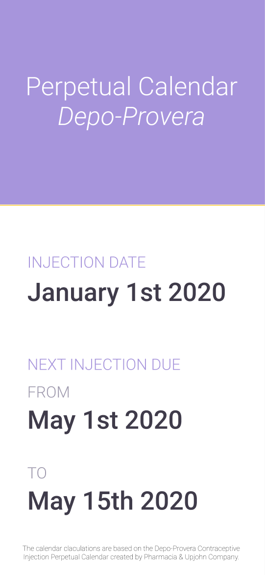
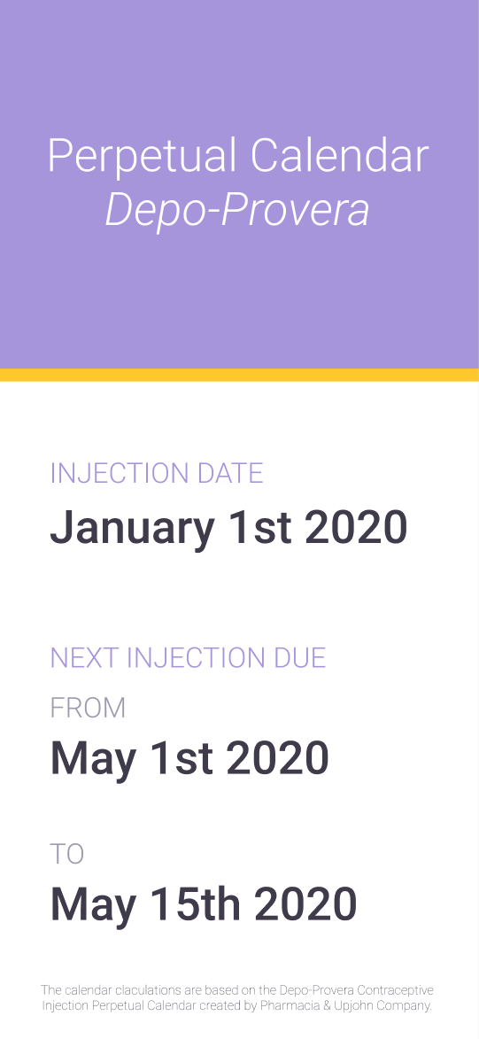
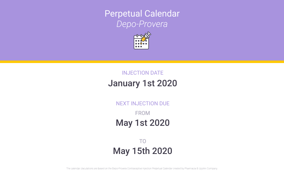
To create the calculator, I needed to know what the calculation would be and how to perform it.
The date-range calculation was as follows:
January & February
Date Range
=
Date of injection + (11 weeks + 1 day)
+
Date of injection + (13 weeks)
Rest of Year
Date Range
=
Date of injection + (11 weeks)
+
Date of injection + (13 weeks)
jQuery UI API displayed the calendar and Moment.js API handled date calculations.
Once I had a low-fidelity prototype, I shared it with my test group to validate the product concept before styling.
To make sure the user could copy and paste the date range in one step, I made the layout responsive where the date range went on one line once there was enough screen space to do so.
The title bar looked crammed on a wider screen, so that also got put into one line on the desktop.
The UX feedback was favorable. However, there was one feature suggestion and one development issue.
Text from nurse
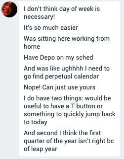
If the user is looking up multiple dates in one sitting, they need a reset button for the injection date. Otherwise, they start to waste time.
User testing occurred in 2020, a leap year, and I had not accounted for February 29th. During my QA and research, I discovered that both of my competitors' products did not account for it either. This meant that my calculator would be the only 100% accurate product.
Leap years are part of the Moment.js API, so it would be possible to correct. Below is the corrected calculation:
January & February of leap years
Date Range
=
Date of injection + (11 weeks + 1 day)
+
Date of injection + (13 weeks)
Rest of Year & non-leap years
Date Range
=
Date of injection + (11 weeks)
+
Date of injection + (13 weeks)
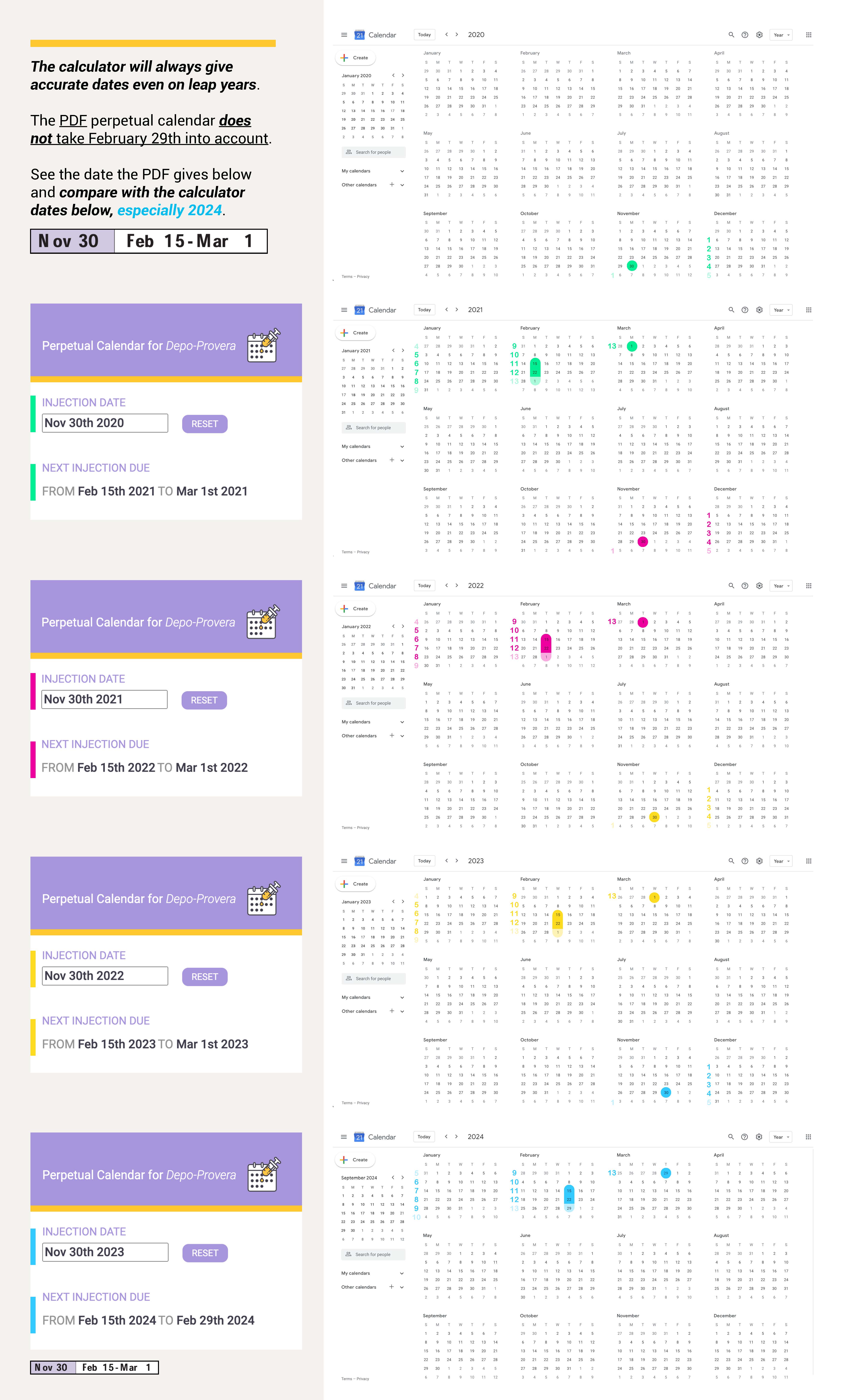
The nurses at the local hospital beta tested it for a month. There was only one problem. The original PDF created by the pharmaceutical company did not account for leap years and was wrong by one day depending on the month and year. But, since Pharmacia and Upjohn Company, an established company, created it, the nurses assumed it was right, and my calculator was wrong.
I created a document to give the user confidence in my calculator, showing full calendar years, screenshots from Pharmacia and Upjohn Company's PDF table, and screenshots from my chrome-extension. The document shows the week count on a real calendar, giving the user confidence.
User confidence PDF of full calendar years from 2020 to 2024 showing week numbers, comparing Pharmacia & Upjohn Company dates to my calculator dates
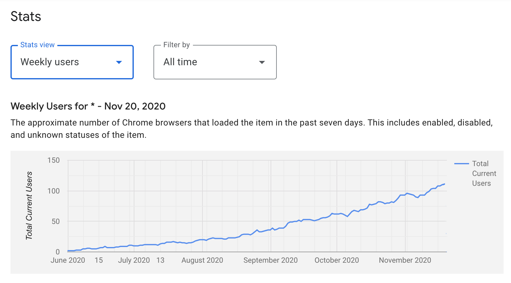
Initially, end users were healthcare workers at a local hospital to determine when their patients needed to have a follow-up Depo-Provera birth control injection appointment. In four and a half months and all through word-of-mouth marketing, both the web-app and chrome-extension each had 250+ returning weekly visitors.
Depo-Provera perpetual calendar calculator Google Web Store analytics
Depo-Provera perpetual calendar calculator Google Analytics
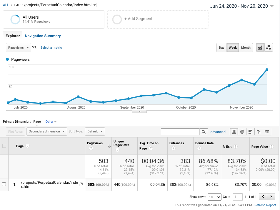
As of March 2021, 250 healthcare workers used it daily internationally.
Depo-Provera perpetual calendar calculator
