National Science Teaching Association (NSTA)
UX Design, Product Management, Instructional Copywriting.
A series of thirteen interactive K-5 science ebooks with pop-ups, graphics, embedded text, and more.
90% of my time at conferences was spent observing and interacting with science teacher attendees while gathering qualitative research on how they used our products.
Adult conference attendees didn’t struggle to understand the science book content because they were science teachers. But I did identify times when it took longer to navigate the ebook UI than I thought it should for an adult. This indicated that a child, the target demographic, would have even more difficulty.
I used this opportunity to uncover how to clarify instructions while simultaneously easing the narrative flow.
The ebook prototype’s narrative text included interactivity instructions. Through design critiques with focus groups, I uncovered that the user flow and the overarching storyline were impeded by the following:
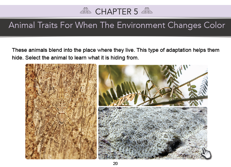
Pilot ebook with outdated hand icon at the bottom right
For our first published ebook, I brainstormed how to solve the instruction implementation problems that were uncovered with the prototype.
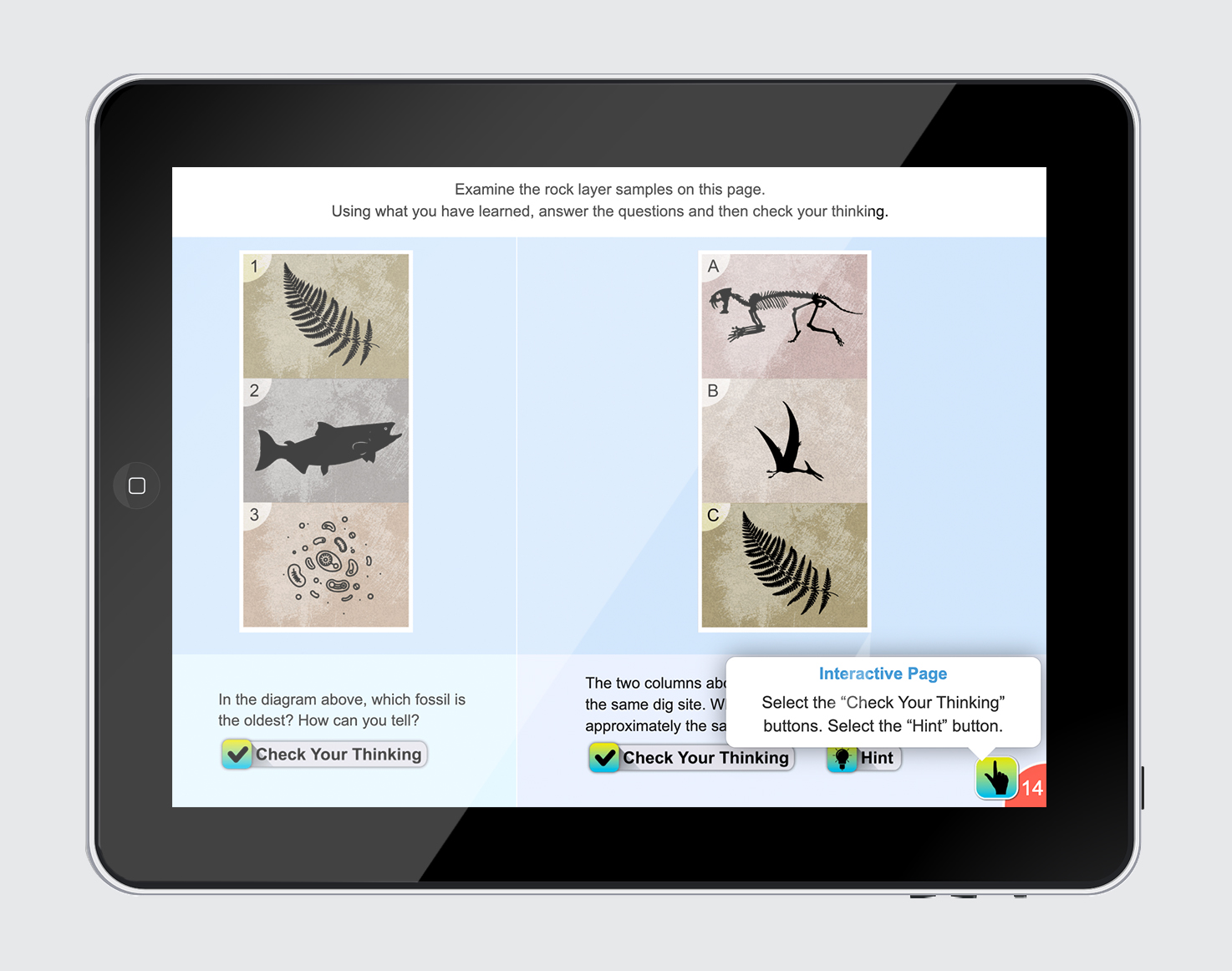
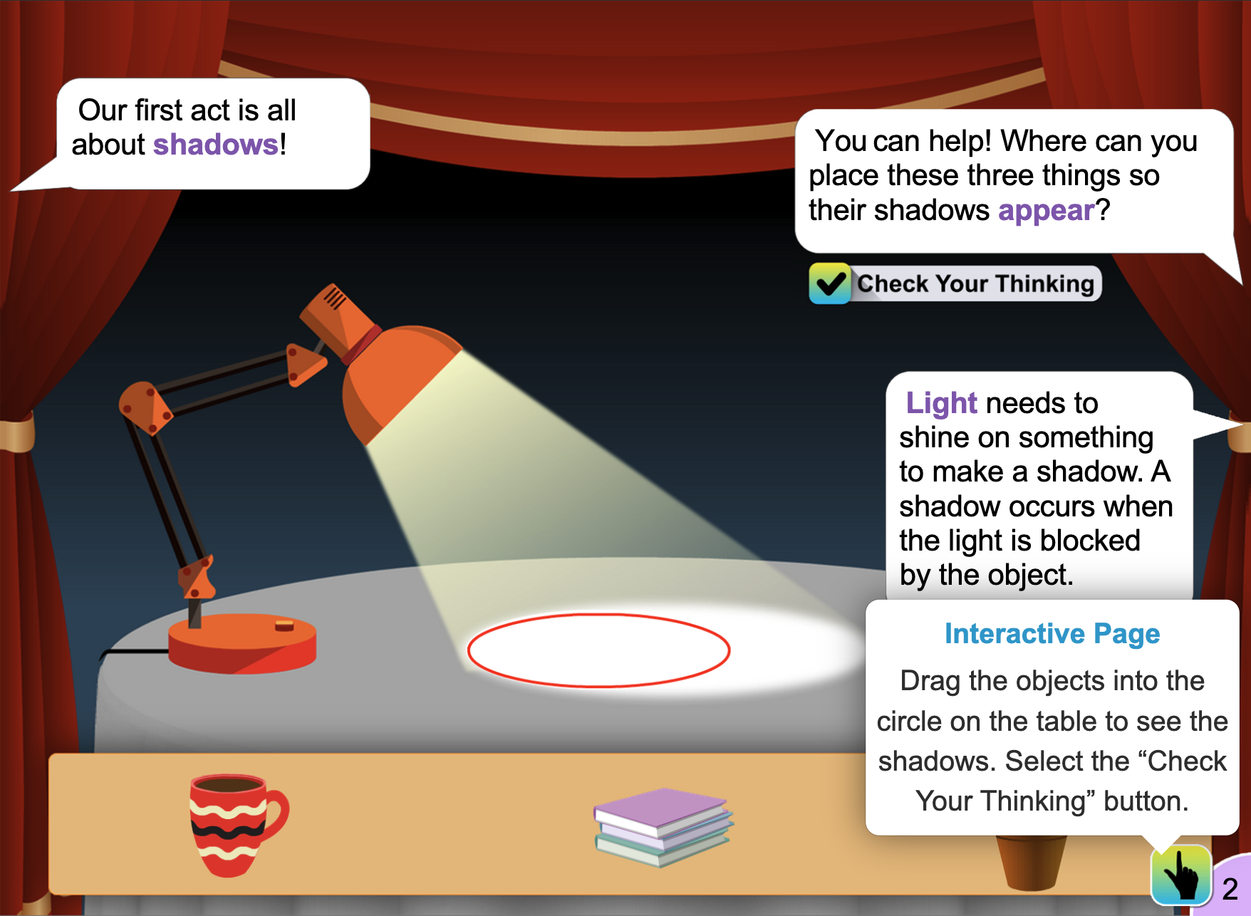
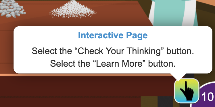
I came up with a pop-up hand icon that signified touch and followed the style guide for interactive design elements.
Location of pop-up button next to page number
To minimally impact the visual design, I placed the pop-up hand button next to the page number. The page number itself could have been the pop-up element, but since K-5 students were the target audience, UI intuitiveness out-weighed style.
All interactive elements needed to follow the same styling for users to recognize their functionality. Through user testing I found bright gradients were more easly recognized as interactive than flat and or softer colors.
Based on evaluative research done at future conferences, I implemented two additional changes.
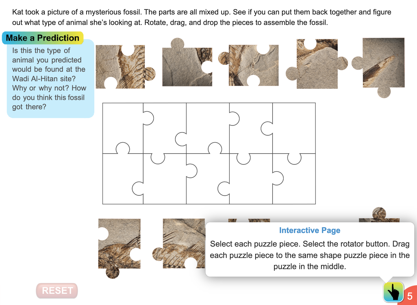
To reduce the impulse to scan or miss instructions, I widened the width of pop-up instruction boxes. It also reduced the frequency of covering other page text.
Before: pop-up boxes covered the main screen’s text, decreasing legibility
After: pop-up boxes were easier to read and didn’t block main screen text
I also revised the text for positive reinforcement so that text didn’t imply right or wrong answers, just instructions to follow.
Narrative text also sometimes repeated pop-up instructions, increasing reading time. To reduce text duplication, I cross-referenced narrative text and pop-up instructions.
Before: the narrative text said, “match each of these things to its shadow” and the pop-up box instructions said, “draft the object into the circle on the table with the matching shadow”. It would have been better to say, “Drag the object onto the tables” in only the pop-up instructions.
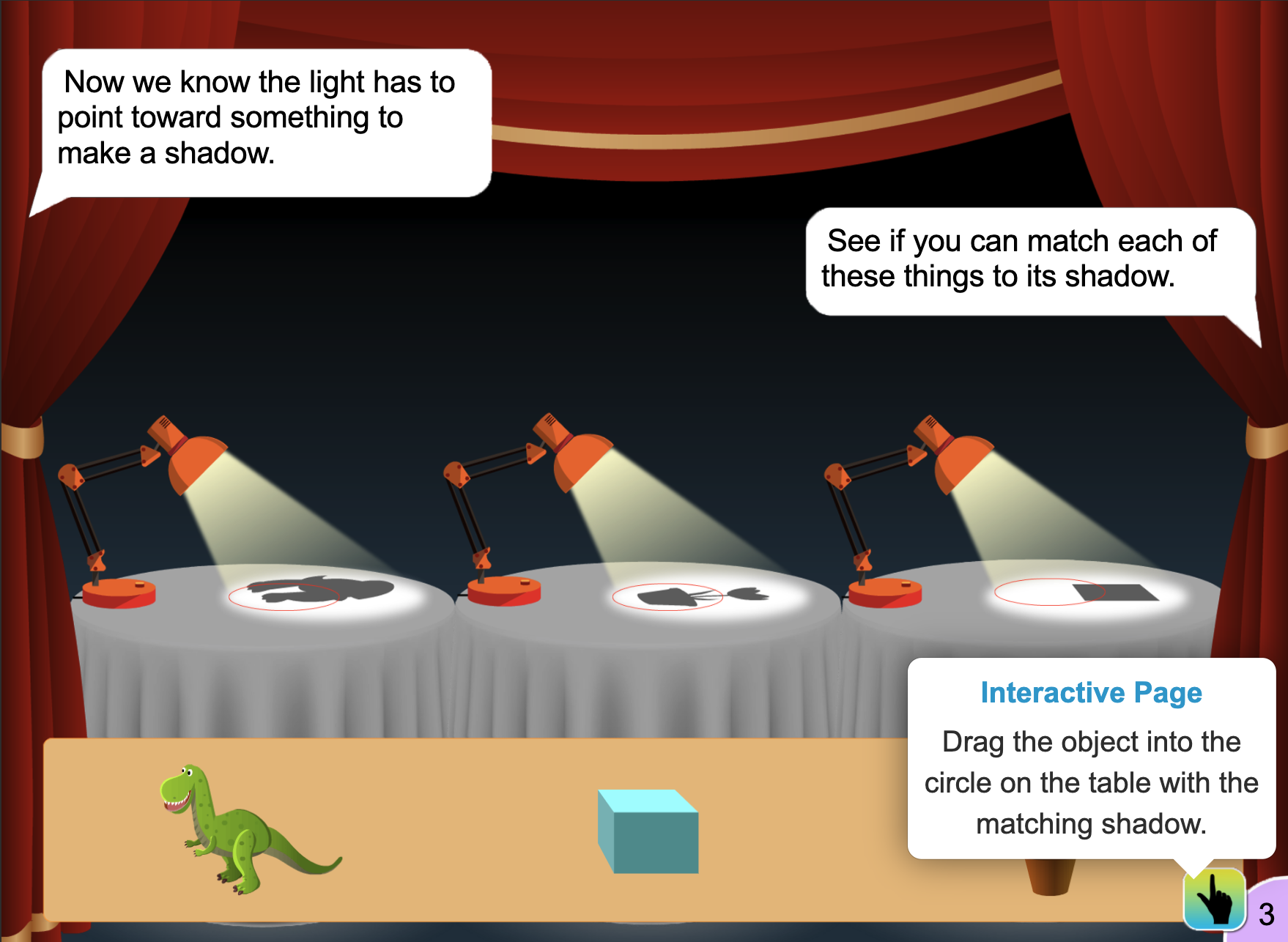
After: narrative text did not repeat information covered in the pop-up box instructions
These changes increased both the reading speed and comprehension of conference attendees markedly.
From the sixth to the thirteenth release, focused on instructional design by making the instructions so easy to find and understand that if the user navigated to any page, the interactivity and associated instructions were obvious.
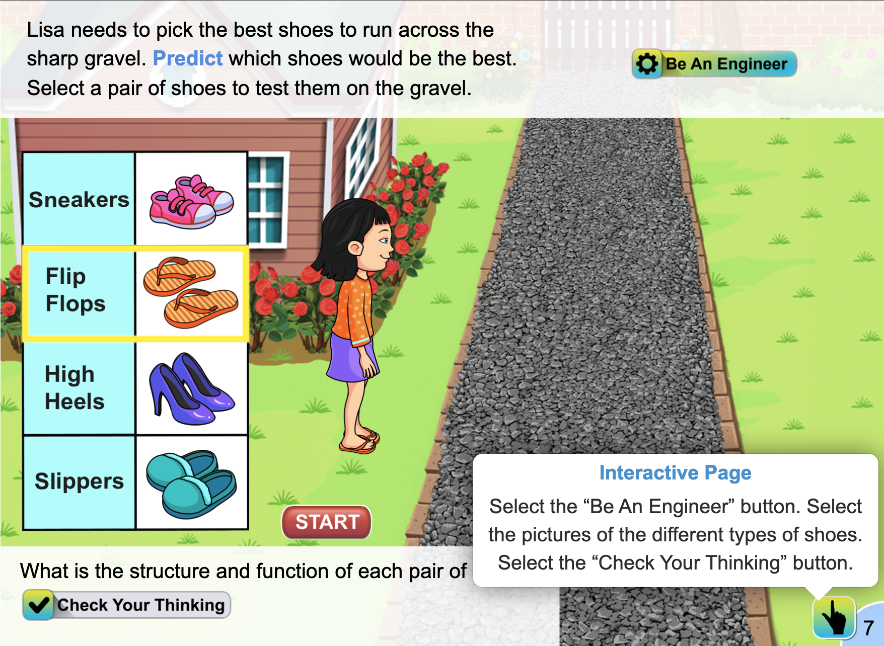
First, I standardized the text for embedded instructions. General instructions became part of the story instead of added at the end of the narrative. The pop-up instructions also told the user exactly what to do without giving any hints to the correct answers.
After: narrative text included the general instructional objective and the pop-up box instructions included how to achieve the objective through the interactive game
Due to budget constraints, we could not retroactively update previous ebooks.
However, by quantifying which books invoked the most questions and which ones garnered the least, I was able to validate that later releases created less and less questions.