National Science Teaching Association (NSTA)
UX/UI Design, Product Design.
Our legacy digital product line included over 200 text-heavy web pages with unintuitive web app-based games and puzzles that did not achieve tangible learning objectives.
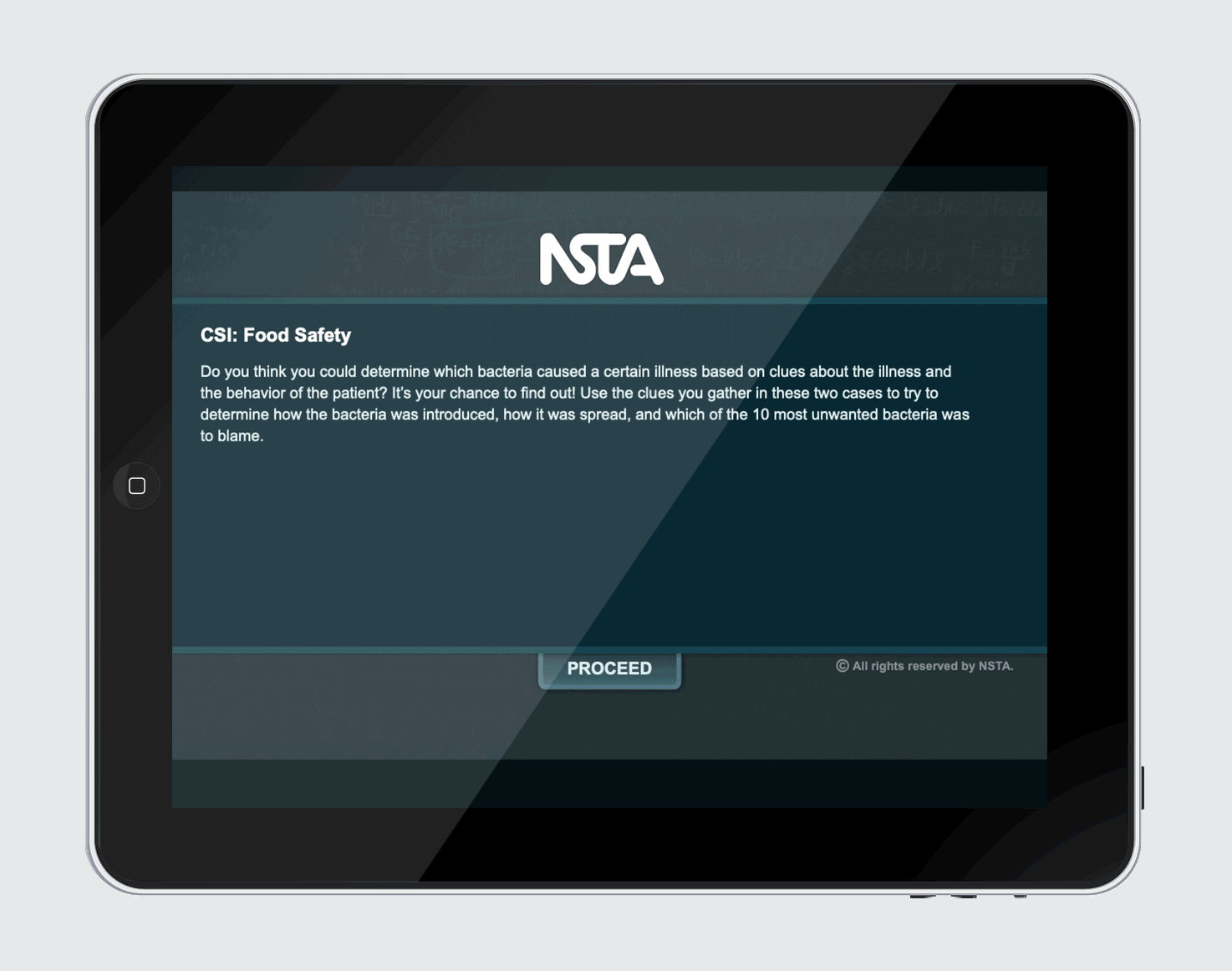
CSI: Food Safety, featured in this case study, was a legacy interactive ebook simulation that needed to be updated, 508 compliant, tested, and more.
Before: legacy screen with outdated UI and unituitive UX
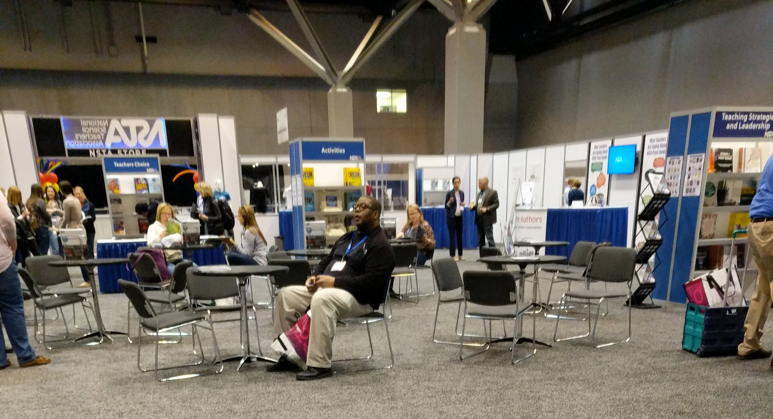
Fortunately, through NSTA conferences across the country, I did user and market research by directly interacting with our buyers and decision makers. By capturing qualitative data from teachers, principals, district-heads, etc., I validated the products’ requirements and customers’ ed-tech needs.
NSTA store at the national conference in St. Louis where I spoke with and observed attendees
Originally, NSTA developed this ebook series as professional and content development for teachers. However, in conference conversations, it became abundantly clear many teachers used and wanted to use the interactives with their students either as a class activity or as self-guided learning.
It had the following issues:
NSTA applied for and won grant funding to modernize UI, remove UX ambiguity, and update the content for all 200 products.
Since these interactives would be used by both middle and high school teachers and students, I needed to ensure the content and UX was usable by all four demographics.
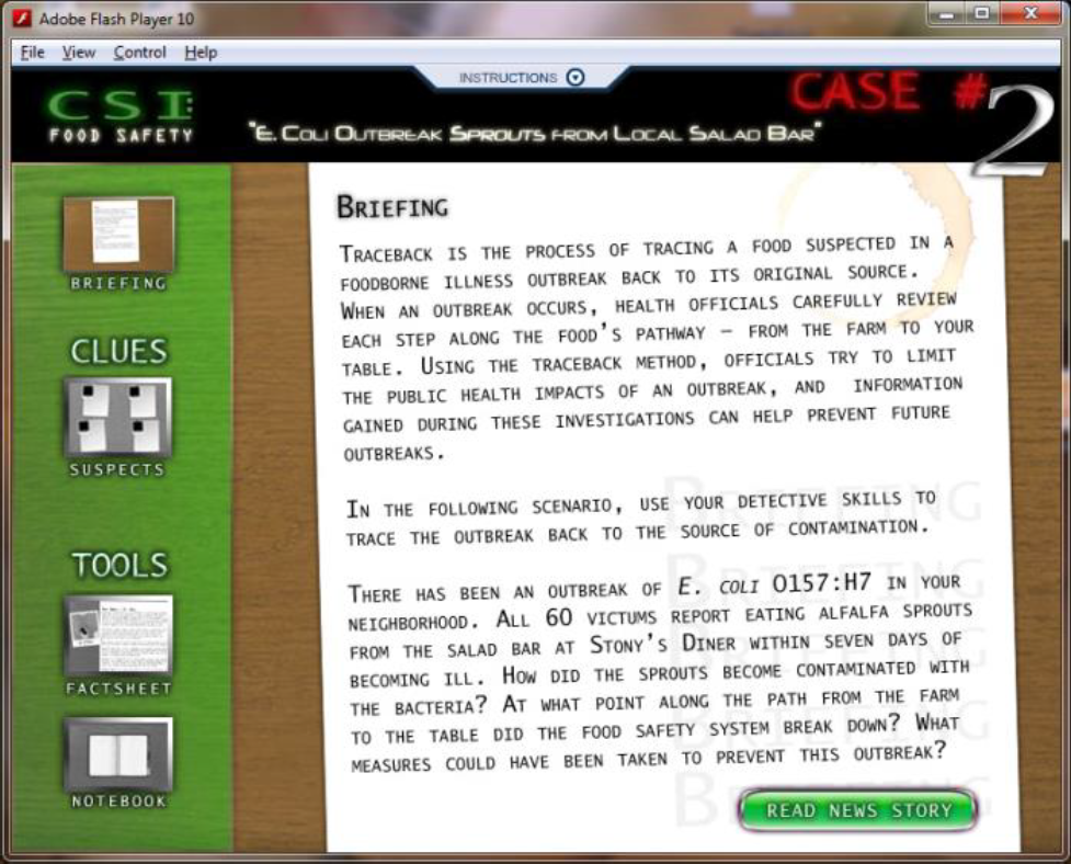
Out of the entire 200 product series, CSI: Food Safety was the most challenging. Users had to make educated inferences or guesses about the provided information to achieve the learning objective–successful detective work.
Each screen and all its information had to be:
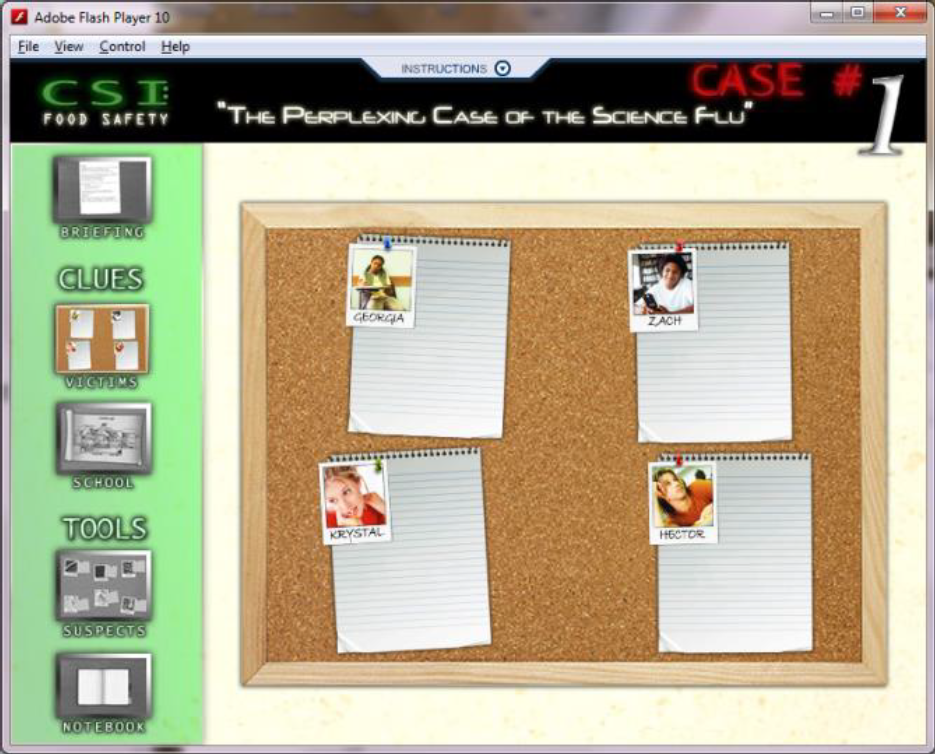
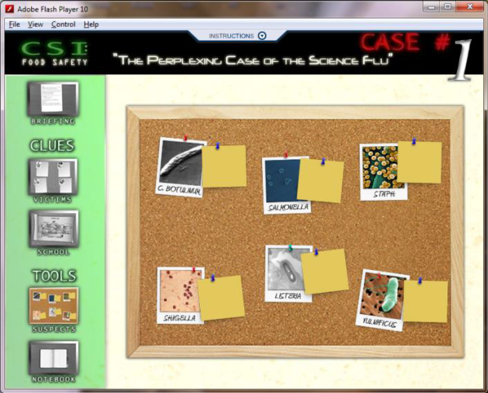
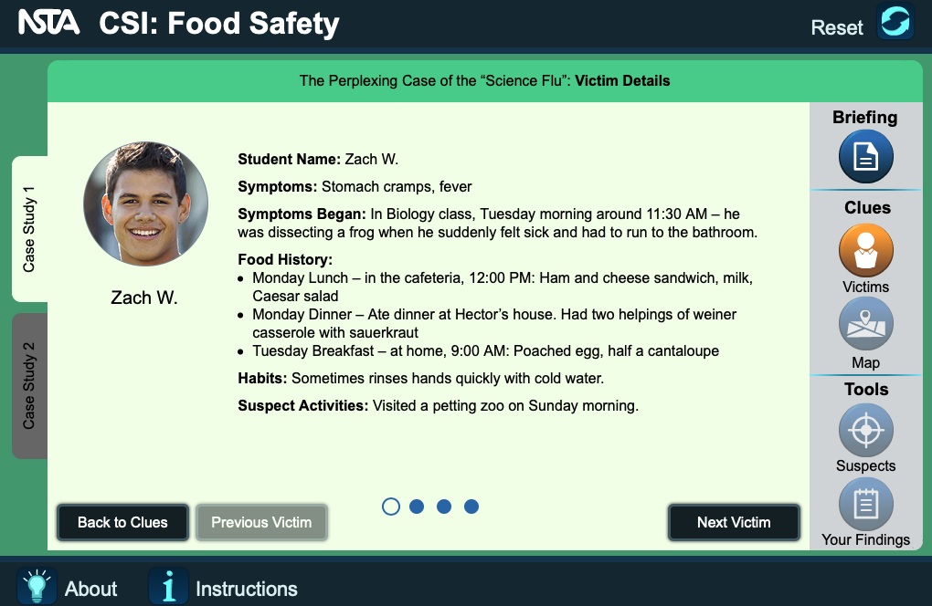
Original: “Victims” screen with no instructions and unclear UX
Design goals developed through storyboarding and designing user flow are laid out below:
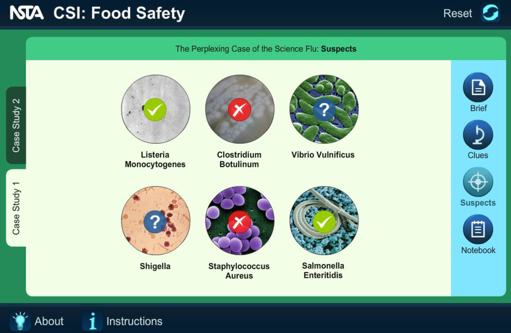
The legacy “Suspects” screen needed a complete UX and UI redesign.
All information was on one screen, but there were clear sections where the text could be split up.
Original: “Suspects” screen with a lot of extraneous design elements, resulting in UX ambiguity
In the initial design round, the different sections were styled as underlined text like hyperlinks, but this line failed to strongly differentiate between a viewed screen and a non-viewed screen.
Originally, a menu-style navigation made sense, but it created other UX issues.
First Iteration: menu-style navigation breaks other ebook design rules and provides insufficient visual contrast between viewed and non-viewed screens
In the second iteration, I changed the menu to a color-coded and tab-style menu as follows:
Second Iteration: colors of the tabs changing depending on the viewed status
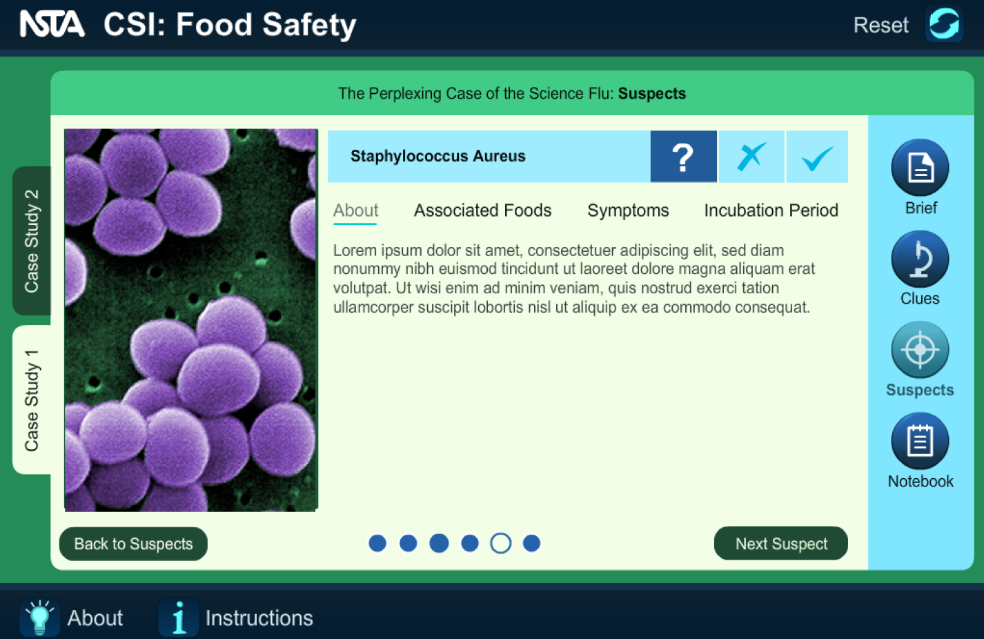
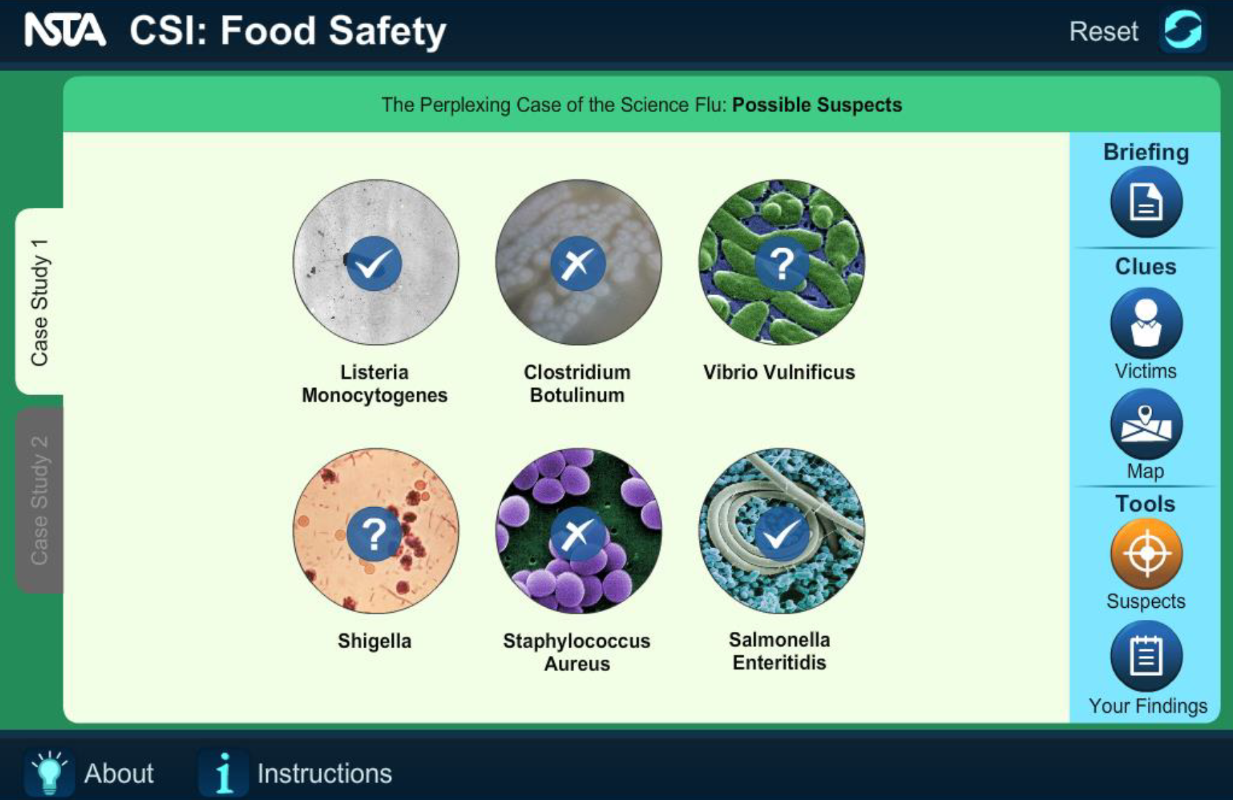
The learning objective of this interactive was for the user to decide which bacterial species is suspect in the case. The legacy app had no method for the user to keep track of their clues and hunches.
Original: “Suspect” bacteria facts with no way for the user to keep track of their thoughts
Based on qualitative research at conferences, teachers and students did not want to use pen/pencil and paper when reading/interacting with our ebooks. The user needed to keep track of their predictions and then access it independent of which tab they were on.
To keep track, I added a title bar with various color-coded icons that could be accessed at any time throughout the book.
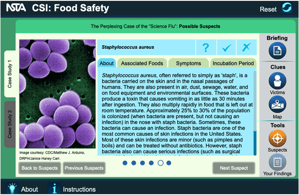
Through A/B testing, the internal review team concluded that the use of color created an association between correct and incorrect.
First Iteration: “Suspect” bacteria icons using color, subconsciously implying right and wrong
However, the user is supposed to make an educated guess, not take an assessment. With this in mind, all options were changed to blue.
Second Iteration: “Suspect” bacteria checkmarks using only blue
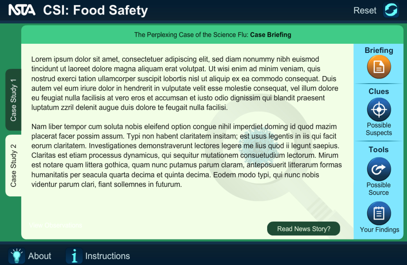
In the first iteration, the text went off-screen, and it was not obvious you needed to scroll right to see the rest. There were a few instances where the sentence was incomplete, providing an implication that the user would need to scroll. However, a few screens had a sentence end at the bottom right of the screen, giving no indication there was more text.
First Iteration: more text is not obvious without a visible scrollbar
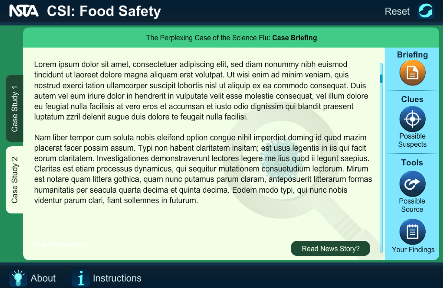
A scrollbar was added to the second development iteration. However, the scrollbar only appeared when the user tried to scroll. Again, this did not fix the issue.
On the third development round, the scrollbar was visible at all times.
Third Iteration: always visible scrollbar
Through usability testing and experience with how middle or high schoolers might use the interactive without adult guidance, the internal team found the interactive to be too exploratory.
More structure to the exploration was added, guiding the user through the interactive and allowing them to move backward and forwards without missing screens. For example, after the first iteration, "Previous" buttons were added, avoiding the user navigating back to the main menu every time to review information.
Labeled menu of buttons guiding the user through the interactive
The interactive was exploratory without the potential for getting stuck in loops that led to frustration.
The UX guided the user through the information while giving them flexibility to review at their discretion, resulting in learning objectives being met.